CASE STUDY CHateau Peyfaures
rebranding . PACKAGING DESIGN . PHOTOGRAPHY . POST PRODUCTION . VIDEO . ADVERTISING . website
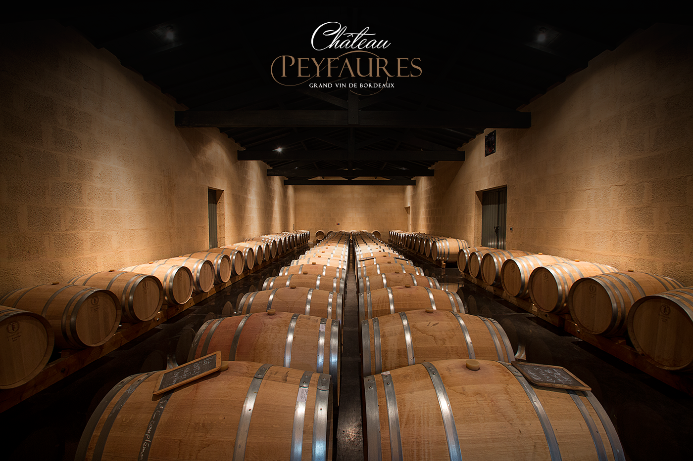
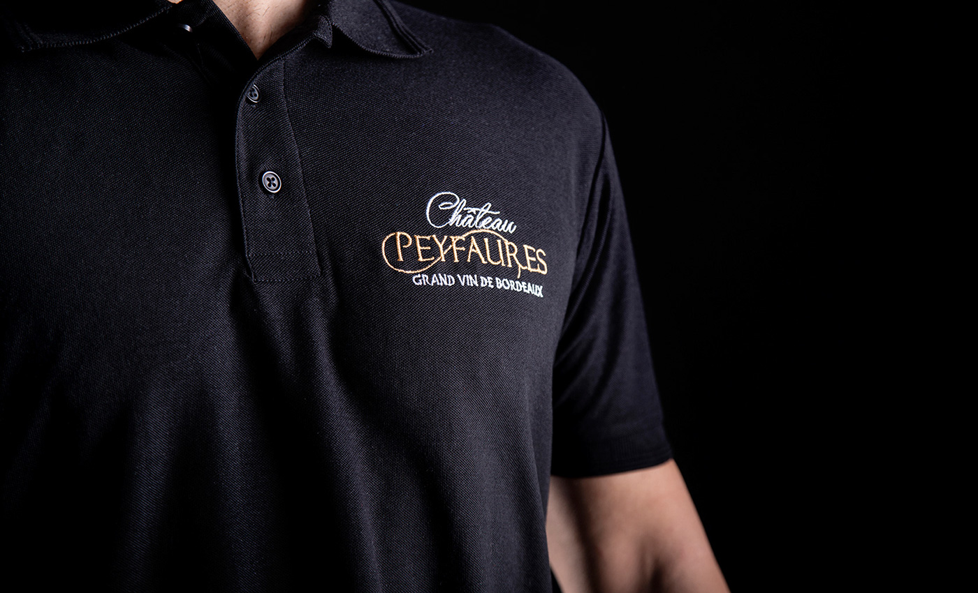
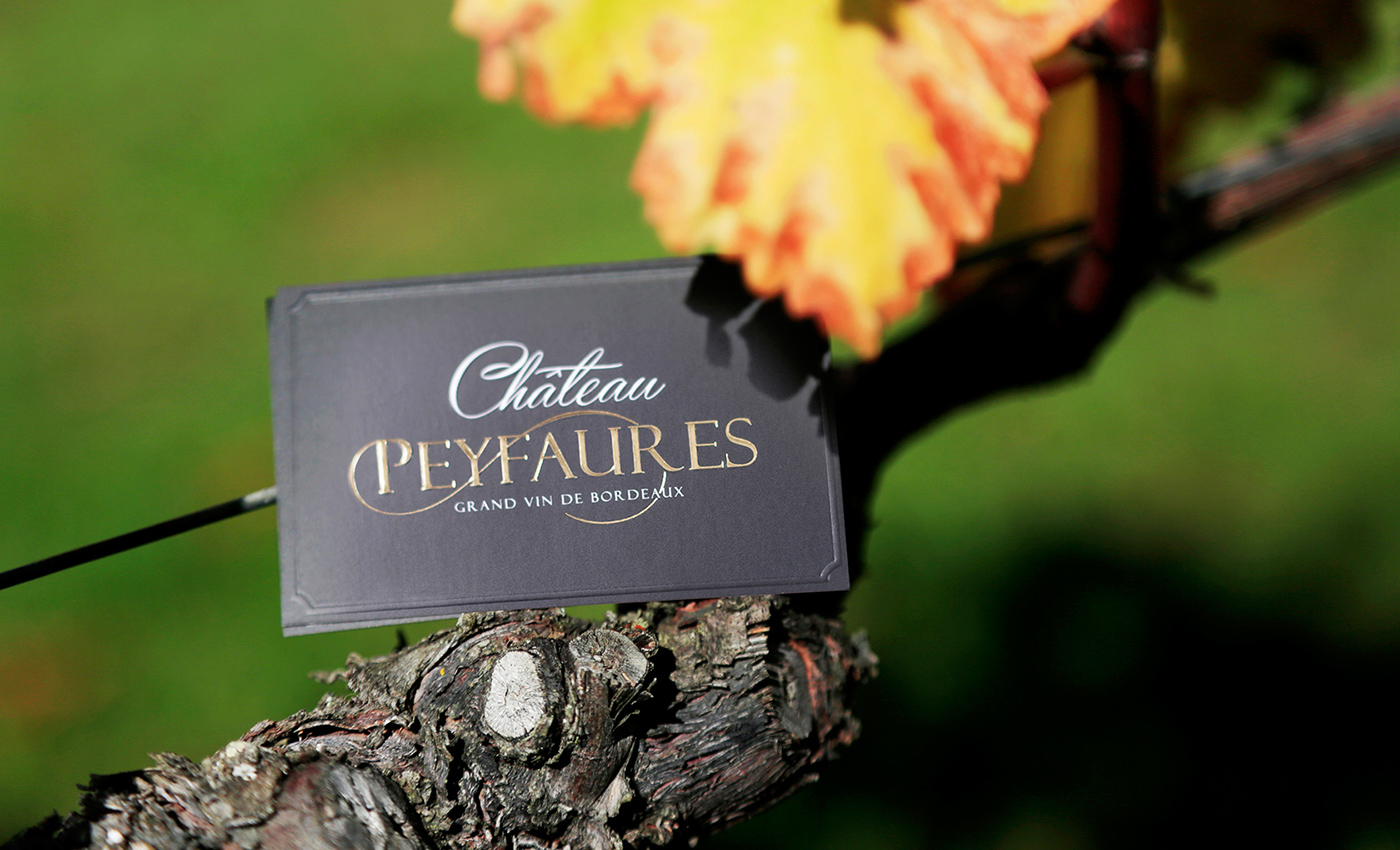
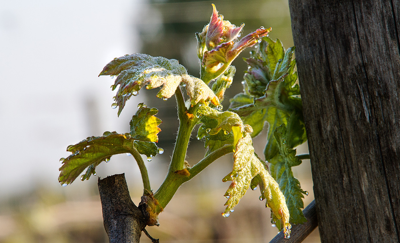
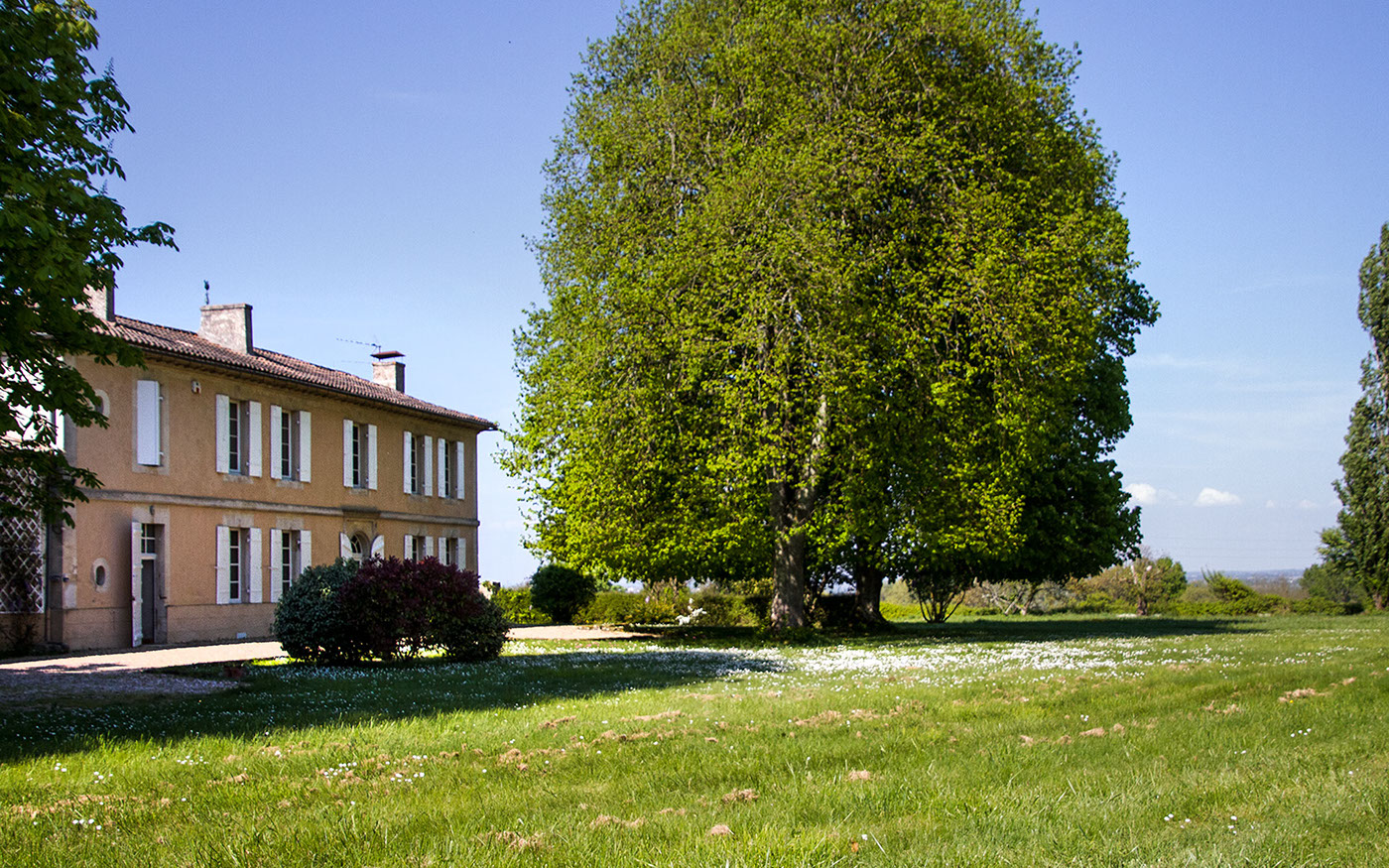
É em Bordéus, terra de colinas verdes com vinhas a perder de vista que ondulam com o vento, que nasce Château Peyfaures. Uma quinta que se orgulha de viver na região que herdou as vinhas mais antigas e conceituadas do mundo. Com uma herança de sete gerações, foi em Portugal e com a experiência no mercado dos vinhos da agência, que a marca foi encontrar a afinidade criativa para avançar com um projeto integrado. Envolveu rebranding mais estacionário, design de rótulos e criação de packaging para os vinhos, realização de vídeo promocional, fotos, publicidade e um novo website. O conceito criativo assentou na diferenciação e no corte visual do tradicional tão caraterístico nas marcas francesas. A intervenção em Château Peyfaures teve enfoque institucional, de forma cristalina mas luxuosa, para valorizar o rebranding.
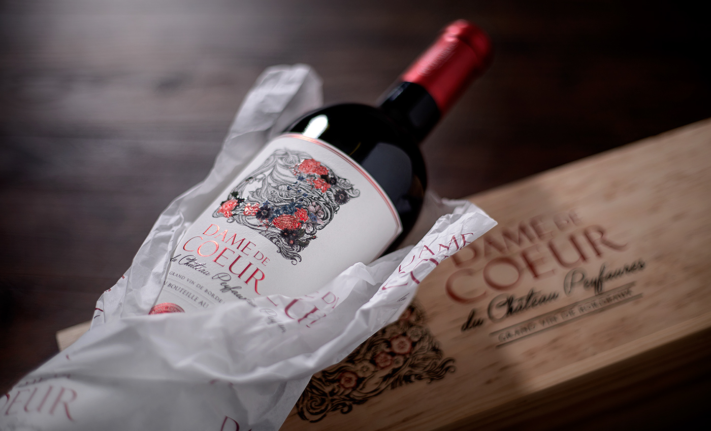
Para Dame de Coeur, segunda marca, a interpretação do conceito foi mais criativa, exigindo um trabalho de ilustração para personificar o verdadeiro sentido da mesma: com a sensibilidade, beleza, bom gosto e harmonia que o género feminino transmite de forma transversal.
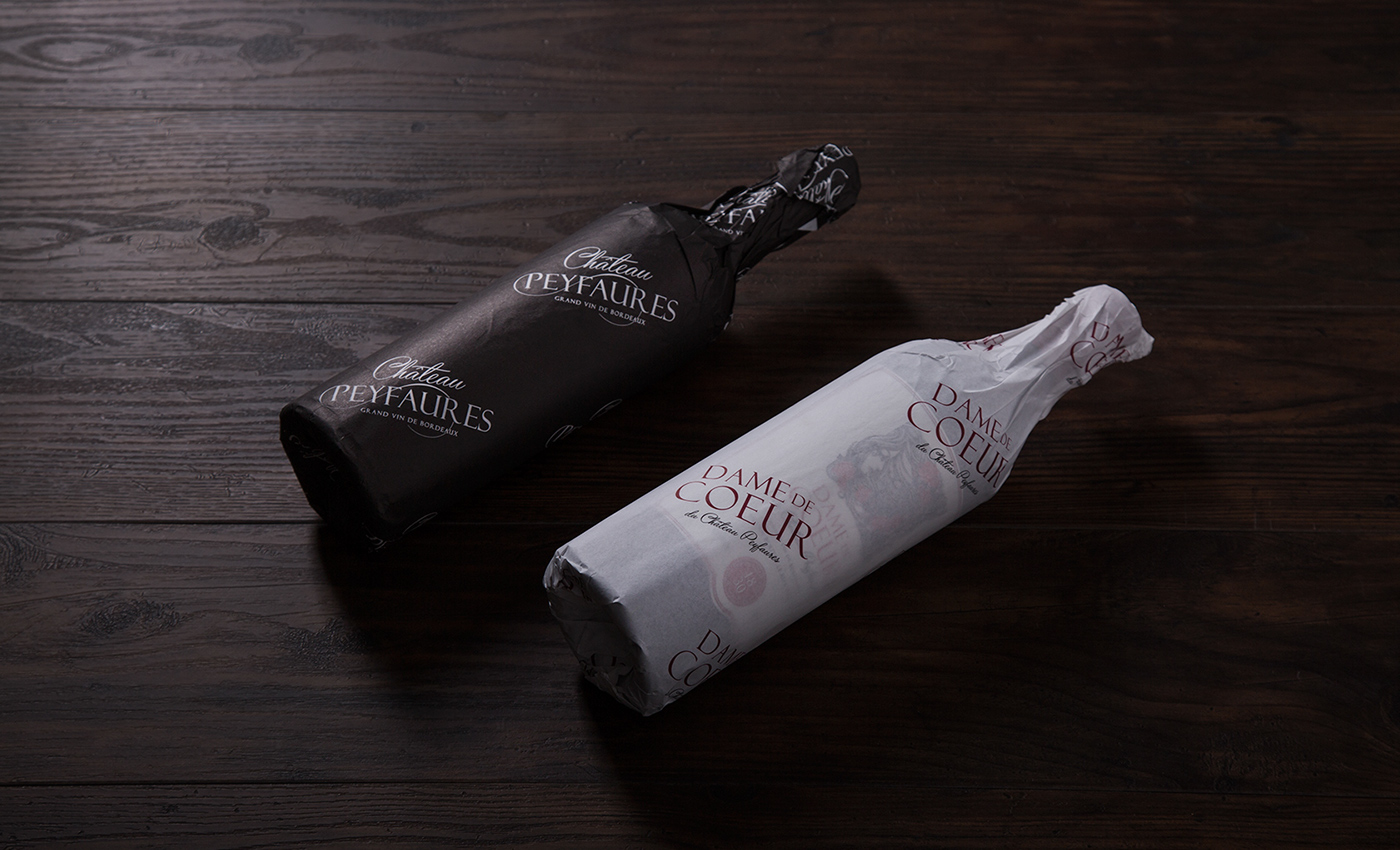
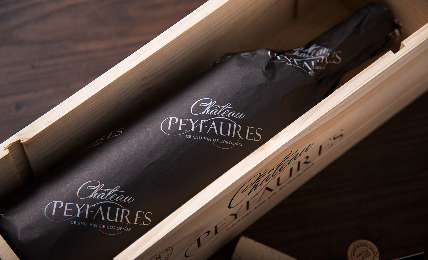
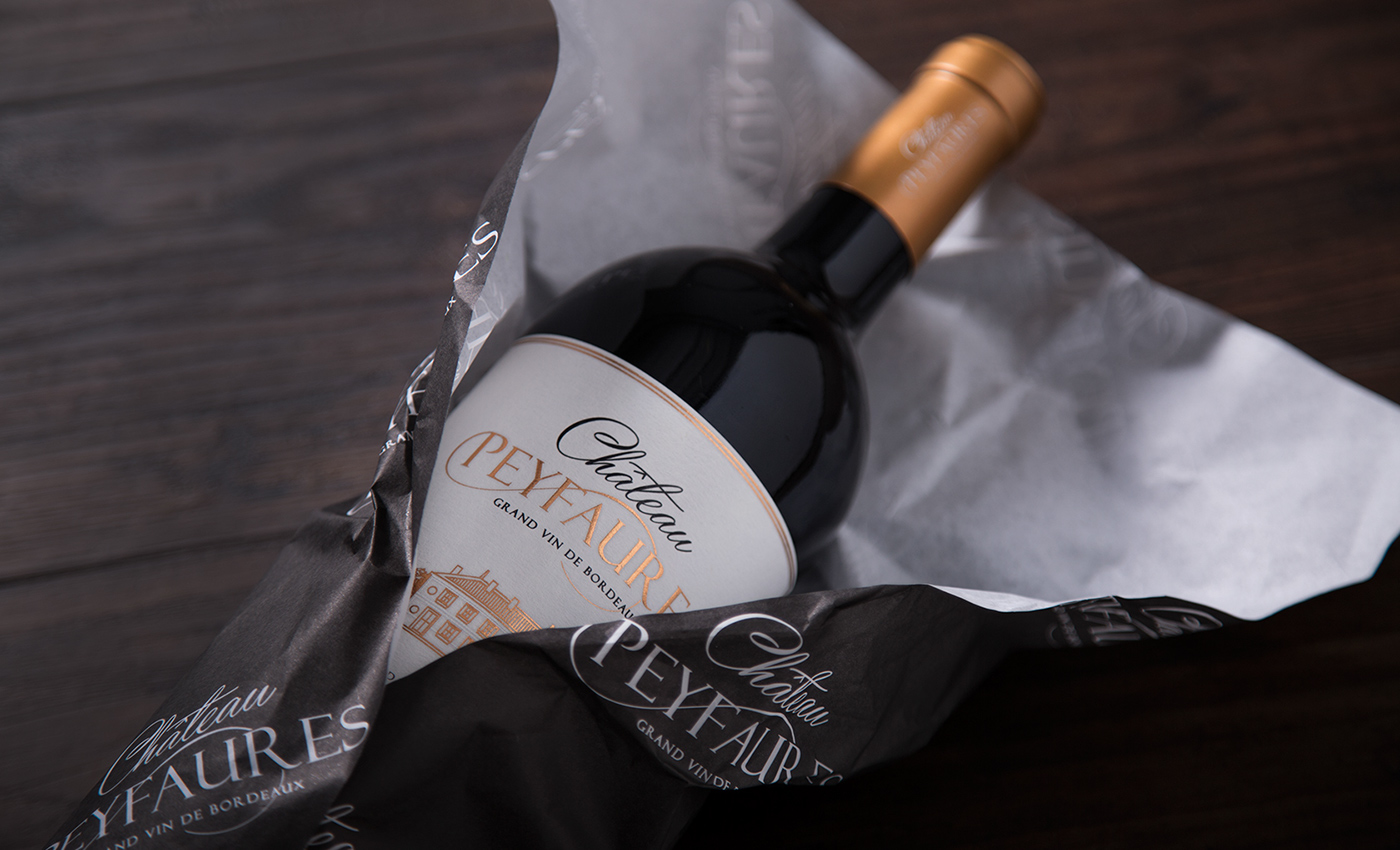
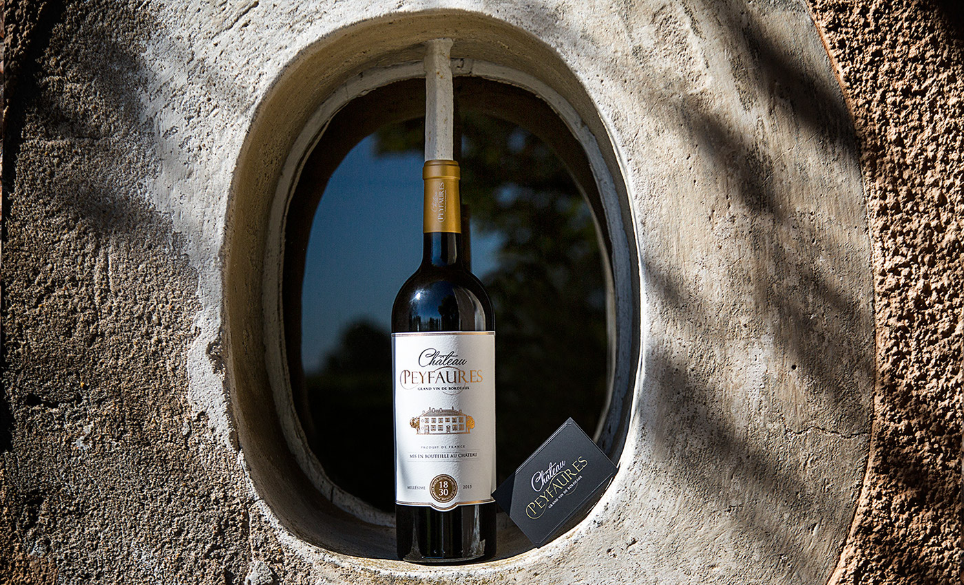
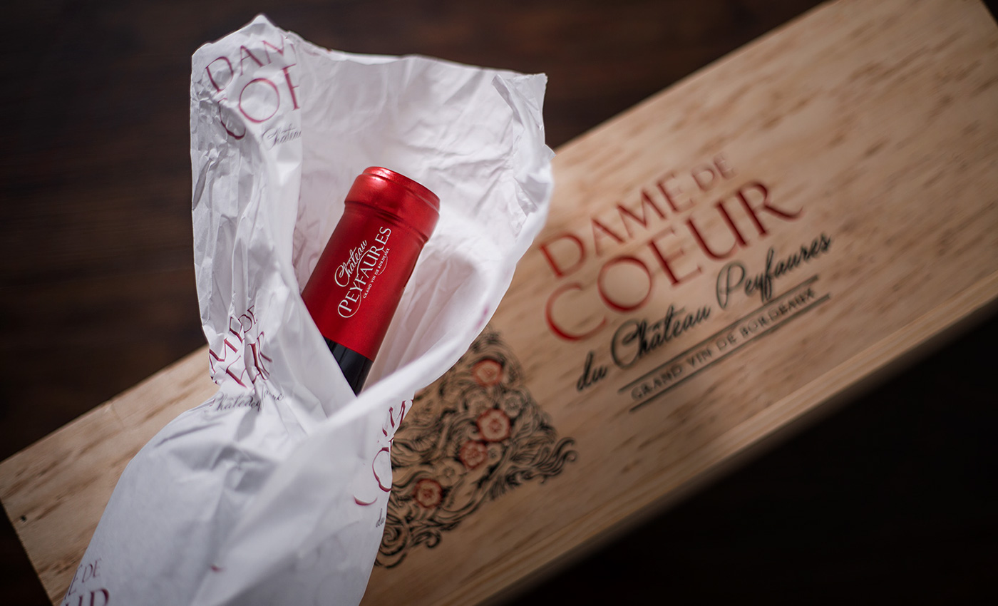
Sendo o posicionamento de Château Peyfaures vocacionado para o segmento médio-alto foi concebido um wrap personalizado para cada marca, para envolver as garrafas no seu próprio branding e desenvolvido um packaging de madeira com acabamentos de luxo.
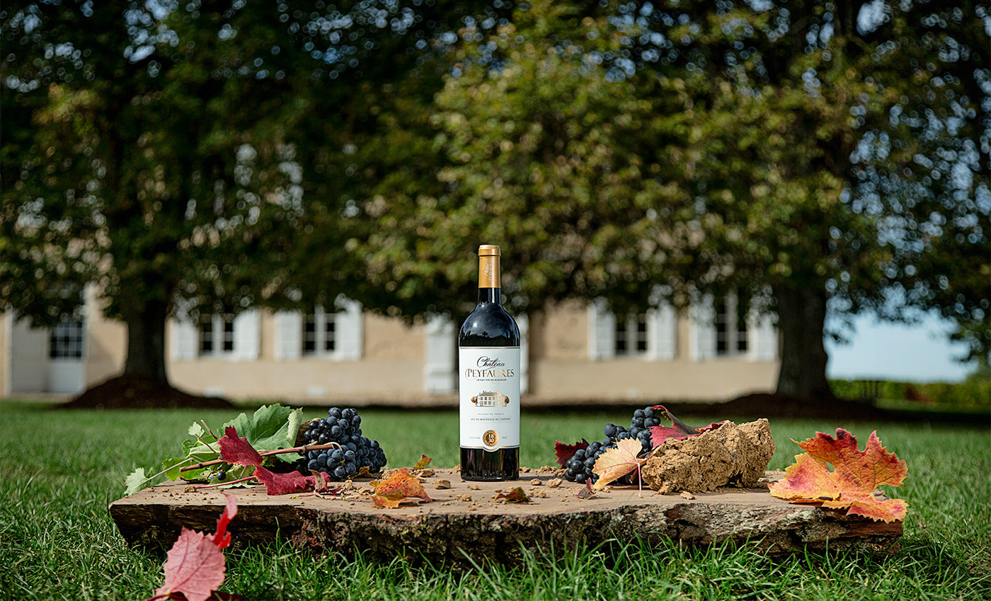
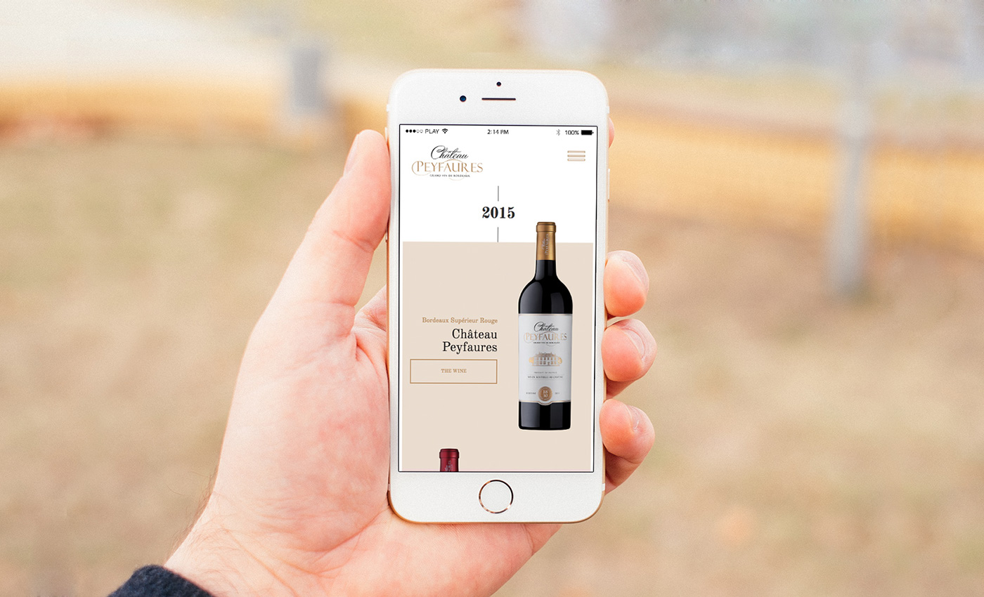
Ao longo de um ano foram recolhidas imagens de fotografia e vídeo da quinta e suas vinhas até ao processo final da vindima e engarrafamento. Um trabalho que fecha um ciclo, com a criação de vários vídeos e conteúdos de imagem para passar para o website. Foram também projetadas várias imagens publicitárias que lançaram uma campanha nacional da marca no mercado americano, saindo nas principais publicações do país.


statement CEO, Chateau Peyfaures
1. How did you find M&A Creative Agency?
I found it via Behance.
2. Why did you decide to contact us? It was our portfolio which inspired you?
The work I saw on the platform was simple amazing and that prompt us not only to contact the agency but we were also convinced that they were the right people for the job
3. What do you think about the creative process. Did we undertsand complety your vision and goals?
The creative process was very good, this is usually a hard thing to get done and conveying what our visions and goals are is no easy task.
These guys got it.
4. Considering the distance, what is your opinion about the process and delivery time?
The distance was not an issues at all, the team was very responsive and communication never slaked.
5. Are you satisfied with the final result of your packaging, website and advertising communication?
We are thrilled with the result to the point that we are looking for the agency to work on the other companies we run.
6. Do you feel confortable to continue to work with M&A Creative Agency?
For sure.
7. Do you have any advice/suggestion that can help us working better?
Keep doing the right thing and never settle. Perfection can only be achieved by the restless and pride in your work most be always the driver.

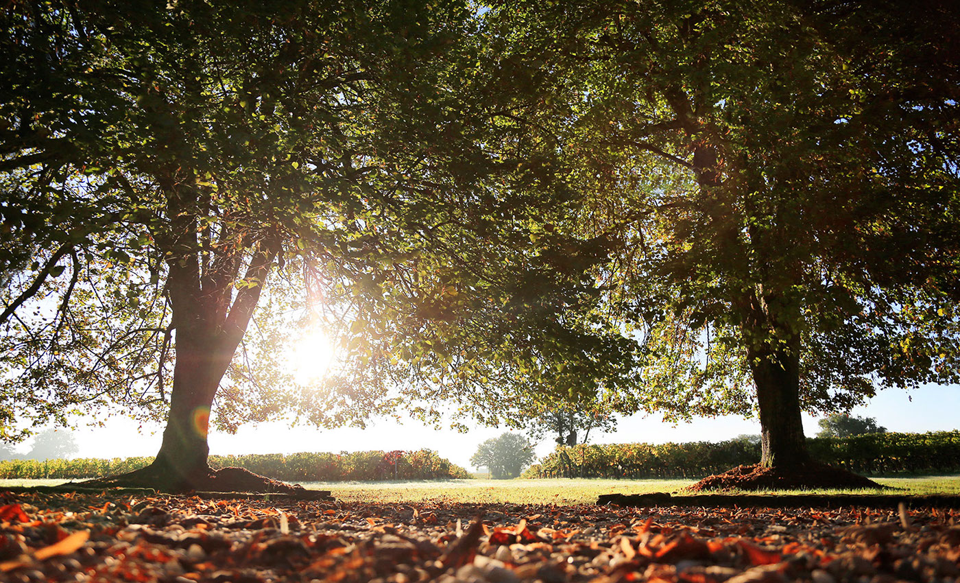


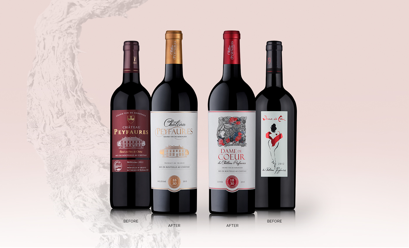


It is in Bordeaux, land of green hills with vineyards with unique terroir and sense of place, that is located Château Peyfaures. An estate that has inherited the oldest and most respected vineyards of the entire world. Seven generations have cared for the estate and now the brand was purchased by an american investor. However it was in Portugal, with M&A Creative Agency, where he found the creative affinity to develop his project of integrated communication: Rebranding, stationary, wine label design, packaging, promotional textile, institutional and promotional video, photography, advertising for the american market and a new website.
The creative goal of this project was to achieve the difference and to create added value, with strength and nobility that would break the taboos of the characteristic image of the french brands.
For the packaging of Château Peyfaures an institutional profile and minimalistic but luxurious was applied, valuing the brand awareness.
Dame de Coeur is the second brand of Château Peyfaures which were more challenging upgrading the previous label with the feminine concept because this wine is a tribute to the founder of Château Peyfaures. So the illustration was fundamental to portray the sensibility, the beauty and the a harmony of Women.
Over the past year, the video and photography team recorded the vineyard evolution, processes and care with the wine production that the producer and the winemaker apply. A part of the work that closes a cycle, creating different content, in particular, the advertising campaign in the main printed editions of USA, the country where the brand will be marketed in first place.
Visit us at creative.grupoma.eu
________
Integrated Communication Project M&A Creative Agency
Client Chateau Peyfaures
Project France . 2017
This is a commercial project
________
Follow us on
________
Follow us on


